Predicting Jalen Reynolds

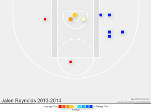
Jalen “Monstar” Reynolds is easily my favorite Xavier University basketball player and, in my opinion, has the greatest opportunity to grow in the coming season. They say there’s a ball he once blocked so hard that it’s still somewhere in the stratospere above his hometown of Detroit. He’s earned his nickname within an incredibly small fraction of the student population by at times displaying athleticism that seems, like the Monstars,  to have been stolen from Patrick Ewing, Larry Johnson, Charles Barkley, Muggsy Bogues, and Shawn Bradley. If he keeps out of foul trouble and is able to fill part of the hole let by Isaiah Philmore then he could  make a big leap.

shotchart

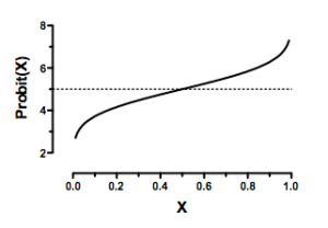
Before doing any sort of predictive analysis, I need to know what I’m predicting. Different positions obviously have different roles and prioritize different actions on the court; Matt Stainbrook, center, isn’t kicking himself over not taking many 3’s and Dee Davis, guard, isn’t too worried about his blocking. I need to determine what stats are most important to a power forward, where Jalen plays the bulk of his minutes. I attempted to do this by creating a probit  regression model, which is similar in spirit to a linear regression, except that it is used to predict binary outcomes (1 or 0). In my case, 1=being drafted during any year a player is eligible and 0=not being drafted by the time their college eligibility is used up. For my sample, I used all 2010-2011 freshmen who played significant minutes (>13) in their first year. For predictors I used a wide range of in-game stats combined. I include a variable attempting to reflect innate talent by normalizing the Rival 150 rankings of top high school seniors from when the class of players were seniors. Unranked players are given a stat of 0 while others have between 1 and 100, with 100 being the highest ranked player.

1470ProbitGraph

The model was very exciting in theory, but in practice, due to a combination of multicollinearity and statistical insignificance, the model is not predictive. Simply put, there is very little that a freshman basketball player does in their first year that impacts if they will make the NBA. An illustrative example is Doug McDermott, who had fairly middling stats in his early years at Creighton, but made his way to an NBA roster largely on the back of a highly efficient blockbuster of a senior year. You can also think about most ‘one-and-done’ players who would have entertained bypassing college for the NBA if they could. They then make the NBA less because of collegiate accomplishment than because of physical skills they already possessed in high school.

It’s okay, I’m not at  ¯\_(ツ)_/¯ yet. In trying to find a combination of significant variables you can get a decent sense of which variables are driving the probability towards 1 by noting the largest positive coefficients across multiple iterations of the model. Combining these observations with some basic intuition about forwards in basketball gives me five stats I can use to compare Reynolds to his peers:

PPWS – Points Per Weighted Shot [PTS / (FGA + (0.475 x FTA))]

A/TO – Assist to Turnover Ratio

PPG – Points per Game

BPG – Blocks per Game

RPG – Rebounds per game

Listing blocks as more important than rebounds for forwards who are typically expected to haul in balls seemed wrong so I did some digging. The variance, how far a set of numbers are spread out, in the RPG sample is larger than that of my BPG sample, so it’s not explained by NBA caliber forwards getting more blocks than their non-NBA peers. More likely is that because I don’t have another statistic measuring defensive effectiveness other than BPG and RPG, BPG is soaking up the increased likelihood of making the NBA that more specific defensive measures would show.

There are three methods of prediction I will use to estimate what Jalen’s second season will look like. The first relies on a linear progression based on a sample of his games that has had all outliers removed, good and bad, to track improvement over the season. The second will be another linear regression based only the games he played the most in and preseason games, this will be the statistical equivalent of hopeful thinking. The final method will incorporate historical data on power forwards from 2011-2013 who had similar first years as Reynolds and apply their average progress to him, forming a sort of bootleg Bayesian prior.

METHOD 1

To start off, here’s Jalen’s actual stat-line using my prioritized forward stats

reynoldsstats2

1. Outliers in basketball stats looks like a player performing uncharacteristically well or poorly. I calculated outliers using a set of stats that discludes games with 0 minutes played. The first method only turned up as an outlier the game against St. John’s where he scored a double-double, though that was also his season high for minutes and shots attempted. While on a per game basis it’s a pretty harsh outlier my intuition tells me that per minute it’s probably not that bad. This is backed up by a PPWS outside of his top 5 PPWSs for the year, meaning that even with higher shooting volume he still is more or less as effective at getting buckets as he is in games where he doesn’t get as many minutes.

2013-2014 stats adjusted for outliers
reynoldsstats3

And now using the updated set of games stats I create five linear regression equations that predict the change in each stat as Jalen gets more experience. X is the number of games played and Y is the statistic being predicted.

PPWS y=0.006x+.8399
AST y=.0093x+.0774
TO y=-.0048x+.6258
PPG y=.0265x+2.9563
BPG y=-.0109x+.6581
RPG y=.0478+2.692

While the negative sign on the unit change of turnovers makes intuitive sense, the negative sign on blocks may not. The two ways to explain decreasing blocks with experience is either as rebounds increase and defensive positioning adjusts to prioritize rebounds, blocks decrease, or it shows model error ¯\_(ツ)_/¯. Either way here is his theoretical statline for next season

type1

This shows somewhat minor progress and is probably not indicative of a player that will be able to consistently step into starter’s minutes. Who knows, maybe in this alternate timeline he develops his J and becomes a threat on both sides of the pick n pop, but probably not. Luckily, this is the most conservative of a my prediction methods.

METHOD 2

Two of the biggest pitfalls of this first prediction method is that it places equal weight on games where a player is asked to come off the bench for short stints and also that linear progress doesn’t intuitively jive when we know players don’t come into the preseason exactly as they left the post-season. My second method attempts to correct for both of these by removing from my sample any game where the player played less than 8 minutes and also factoring the four preseason games Xavier played in Brazil less than a month ago.

Here’s Jalen during Xavier trip to Brazil where he averaged a double-double
preseason

And here’s what his adjusted statline looks like using games where he played >= 15mpg and preseason
adjusted1

This method is definitely more optimistic than the first method. But one call-out is even if Jalen remains as efficient getting little playing time as he does when he gets more time there’s a causality dilemma here – Does a player play better because they have more time to get adjusted to the game or are they getting more time because they are playing better – that hinders the predictive ability of this method. That being said here are the new linear regression equations for each stat.

PPWS y=-.0293x+1.4771
A y=0.3529
TO y=.0049x+.8971
PPG y=.424x+4.0662
BPG y=-.0098x+1.0294
RPG y=..2721x+4.7279

Interestingly, the decreasing PPWS and increasing PPG means ya theoretical boy is getting buckets, but with abysmal efficiency. This is a man redefining ‘volume shooter’. Here’s the predicted statline based on these.
type2

For comparison here’s Julius Randle, the first power forward selected in the 2014 NBA draft
randle

AW FRICK YEAH

METHOD 3

Using linear regressions to predict future performance has some significant issues. One of the biggest is that basketball players historically don’t get sequentially statistically better with each game and they don’t pick up exactly where they left off the previous season. There’s a huge difference between the JaMarcus Russell off-season plan and the Giannis Antetokounmpo plan.

In this method I use historical data on freshmen forwards from the 10/11-12/13 seasons who averaged 15 or more minutes per game, meaning I again use a truncated set of Jalen Reynold’s games. Since my data set of historical freshman stats only includes player with >13.5 MPG, I use a subset of Jalen’s stats from games where he played >= 14 minutes. I identify the top ten players most similar to Jalen using the top five stats I’ve been following throughout this analysis. Ideally I would have something like a similarity score, but for my purposes generally eyeballing it isn’t too difficult. For reference, the most similar player I found is probably Rico Gathers who played his freshmen year in the 12-13 season for the Baylors Bears.

I use this set of similar players to calculate how much, on average, a player with stats like Jalen Reynolds changes from this first to their second year of college ball.  Below is the change in each stat from the player’s first to second year.

RPG 45%
BPG 46%
A/TO 25%
PPWS -2%
PPG 64%

There are of course some players that got better than these averages suggest, and others that don’t get much better or even have their flaws exposed by increased playing time. Within the set of players Jalen’s ceiling may look something like Kansas’ Perry Ellis or Louisville’s Montrezl Harrell. Based on the average change in stats here’s what this method predicts for Jalen this year.

method3

These numbers fall nicely between the previous two prediction methods, except for PPWS. According to my set of games where Jalen got significant minutes he’s very efficient, 1.2 puts him easily in the top 20% of his peers in that regard.  They also look like the stats he put up during the preseason in Brazil, but adjusted for quality of play. It’s important to note that while this isn’t as blatantly optimistic as the second method, this stat-line still reflects a player who would be making a HUGE impact playing alongside a healthy Matt Stainbrook. Having two big men capable of getting the double-double any given night is not a bad formula for success.

SUMMARY

Predicting the success of a player on only one season of data is very difficult and may well be a fool’s errand based on the number of unsuccessful formulations of probit regression models I attempted. Predicting subsequent year ability may not be much easier but it at least requires two areas of understanding 1. how good was the player in the previous year, and 2. what kind of improvement will they experience over the summer.

My analysis answers the first problem by dividing Jalen Reynolds’ season up a number of ways to grasp what kind of game could truly be expected of him on average at the end of the season. For the second problem this analysis used linear gains and historical averages as stand ins for whatever improvements have been made.

Finally, here are the three predicted statlines stacked for comparison
1. type1
2. type2
3. method3

Jalen+Reynolds+East+Basketball+Tournament+0E--c6fkAQml

Want my data? You’re going to have to email me at murraym6@xavier.edu, there’s a lot of it. God help your soul.

NBA players by state

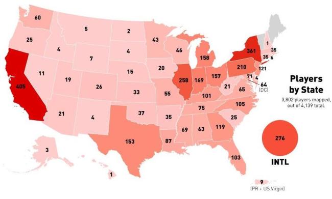
Predicting NBA success is incredibly difficult. With the NBA draft coming up I thought I would look at what part of the United States is most likely to produce NBA players. If you take a random child from birth, the formula for NBA success is some combination of culture, infrastructure, access, and genetic lottery. All of these are very difficult to quantify, but using the home states of the current players in the NBA we can get some insight into the first three.

Image

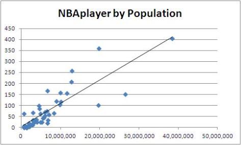
I found this handy graphic that has some totals and I also have 2013 population estimates to make some quick n dirty NBA players per capita calculations. But first, I’ll check how the number of NBA players varies with population.

Image

Unsurprisingly there is a strong positive correlation between population and the number of NBA players that come from that area. The predictive ability of population for NBA success is statistically significant at a 95% confidence level with and R-squared value of nearly 73%, meaning nearly 73% of the variance in the number of NBA players from a state is due to the population of that state.

Here are the states reordered by number of active NBA players per 100,000 state residents

Image

The results are interesting and I don’t have the insight to explain them. The eye test says these results probably don’t correlate with NBA media markets or proximity to successful college programs, but that’s all from the hip. There are a couple of ways I may expand this in the future, with # of NBA teams, # of division 1 college basketball programs, # of AAU clubs, and some kind of childhood nutritional measure, off the top of my head.

Want my data? God help your soul http://sharesend.com/k8a41m5q

Ass, Shit, Bitch, Fuck

typical_librarian

The new-ish Google Ngram Viewer has been getting some well deserved love from data journalism and number-affiliated word vomit sites (aka my competitors). This tool draws on over 5.2 million books from between 1500 and 2008 that have been digitized by the Google Library Project and gives a graphical representation of how often different words and phrases are used. You can then paint with the world’s broadest brush and conclude that that represents that word/phrase’s place in culture over time.

To see Ngram used really well, take a look at this piece from the ‘Regressing’ blog at Deadspin. To see it used poorly, continue reading.

Before Mr. Fischer-Baum wrote his piece I believe he did a different type of analysis altogether that never got published. In fact, I would bet that if you, the reader, went to the Ngram Viewer now you would do the same thing.

You would type in cuss words.

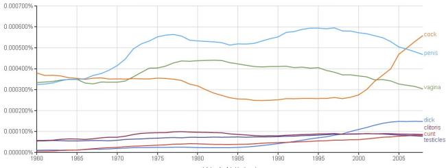
Because no one was brave enough to post their results, I’ll do it, I’ll be the hero. For my list of words I went with what words off the top of my head would make my poor mother wince

Image

Some interesting narratives could be teased out of this. First, clearly the 60s were a helluva time. Second, I’m seeing some poop-related correlation between shit and ass. Third, there also seems to be some kind of relationship between anatomical cuss words. To investigate these more I divide into two categories; bad words that are about poop, and bad words that are about the sex bits. I know there’s probably some crossover there but I’m going to ignore that for simplicity.

Butt Stuff
Image

1997-98 was an incredible time for asses it seems, and I’m determined to know why. Sir Mixalot’s seminal ‘Baby Got Back’ was released in 1992 (conveniently, I was also released in 1992) so that can’t be it. The top song of 1997 was Elton John’s ‘Candle in the Wind’, I don’t think that’s it either. For nearly a decade (1995-2005) its increase in appearance was almost exactly the same as ‘shit”s, which could signal a general cultural acceptance of talking about butt related things, but as I mentioned, making sweeping generalizations about culture based off of Ngram is tricky.

Sex Bits
Image

Here the story is all about ‘cock’, it’s had a meteoric rise starting in 2000. I actually switched out the data for ‘cock’ with blood-flow to the penis during an erection. You have no way of knowing if I’m lying because the graphs would look the exact same 1985-2008.

JMart, His Dankness

Image

This popped up on my time line this morning and I have to say I’m a little surprised. It did not surprise me when Justin “Contested 3” Martin left Xavier but none of the programs he’s looking to transfer to seem like vertical moves. Most of this is based on each team’s recent history and my knowledge of them, which is not a lot. I also don’t know enough about basketball schemes to know whether or not Justin “Dribble through the Press” Martin is a good fit for a program, but I assume that variable is approximately equal across all programs he’s looking at.

To see if my assumption was correct about program strength I looked up some basic information on each team. MIN/G is minutes per game.

Image

The most obvious thing here is that even for it’s strong incoming class, Xavier is losing a large amount of its minutes while the three other schools are retaining the bulk of their program. Incoming class rank is misleading because though 247sports had the most comprehensive list, its ranking of SMU is WAY off espn, rivals, and yahoo, who all have SMU’s class somewhere around 30. Tournament success is also misleading, though Xavier was the only team in the NCAA tournament, SMU and FSU very likely could have been close competitors to Xavier. Overall, it’s clear that none of the three teams JMart is looking at are a clear step up from Xavier.

However, there’s another consideration that may be coloring his decision

Image

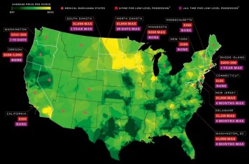
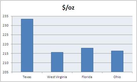
Using data from priceofweed.com (welcome to the future) here is some info someone might want to show Justin “Lazy Ass Layup” Martin.

Image

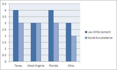
Scores here are out of 5, with 5 meaning that laws are heavily enforced and people are intolerant of marijuana smoking

Image

SMU probably has the best incoming freshman class after Xavier, and they’re retaining a lot of minutes from last year, but it is probably the worst fit on this whole list for JMart. If he did not enjoy his time with the Jesuits, wait until he meets a Methodist. The scores for law enforcement and social acceptance I’m guessing are much higher than for the rest of the state of Texas.

As much as I was not looking forward to watching a team where Justin “Shuffle back on D” Martin was considered the veteran leader, I don’t believe he did himself a great favor by transferring if these are his options. So long JMart.

Image

Want my data? God help your soul http://sharesend.com/30p5mqd8

Kidnappings

Image

A number of my friends are spending a chunk of their summer in Europe. Now I’ve never seen conclusive evidence that Europe exists, so all I know for certain is that a number of my friends need some time away from me. It’s kind of like when your parents would spell a word to each other, or when you spell out W-A-L-K in front of your dog. They’re in “Europe”. So how am I supposed to know they’re not gone forever?

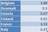
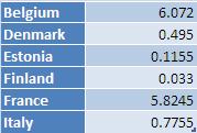
Assuming they intend on coming back the main thing that could prevent them is kidnapping. Kidnapping statistics are hard to come by for adults, so these numbers are about half a decade outdated and don’t include all the countries my friends are visiting, but you’re Reading ShittyData and the sky is blue. Numbers are per 100,000 citizens.

Image

It just so happens that the two travelers I’m most concerned for are both female and females are kidnapped in foreign countries significantly more frequently than males, 65% of kidnappings are of females. Adjusting for gender changes each country’s kidnapping rate.

Image

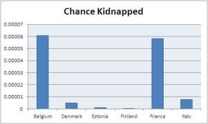
Divide by 100,000 to find the chance of being kidnapped per person by country. Graphed because decimals are hard and I didn’t line them up well.

Image

chancekidnapped

But what do these numbers mean? They look small, but are they? We need to contextualize this using the odds of being dealt a Straight Flush is poker, winning $1,000,000 and $10,000 in the Powerball lottery, and being in a car crash before they get back.

otherodds

Some possible conclusions is that I am better off betting the field that none of these things will happen, but I should probably still drive carefully (1 in 10,000!).

Want my data? God help your soul http://sharesend.com/u1glt51v

“I finished an Ironman”

Image

Once all of the mountains have been climbed, the jungles mapped, and the oceans crossed there’s not a lot for modern man to conquer. To compensate, we create ridiculous challenges for ourselves that we pretend are a test of the human spirit. Take the marathon, tens of thousands of people each year pay enormous fees to run a distance that was once run by a person who died after completing it. Or, if that doesn’t satisfy your deep dissatisfaction with your almost meaningless existence you can pay even more to run through mud and wait in line behind college besties getting their new profile pic for an “obstacle” that probably involves using a basic skill that is considered significant only because so many have let things like “jumping” and “crawling” atrophy into the warm, painless company of a couch and a television. And for that you get a t-shirt that proves you’re a Warrior. I have some personal experience with this.

Image

For some even these aren’t enough and they move on to even more difficult races and challenges such as the Ironman Triathlon. A day long race consisting of a 2.4 mile swim/112m bike/26.2m run, an Ironman is just about the pinnacle of physical and mental endurance or stupidity, whichever you prefer. Fittingly, they take a long ass time to finish, and as I did during my marathon, I wonder if participants think of all the the things they could be doing instead, probably somewhere around mile 60 of the bike. It’s simply opportunity cost, the marginal benefit of doing your next best option.

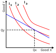
Image

For this particular exercise imagine Good X is how much of an Ironman you complete and Good Y will be how many Ironman movies you watch. The red lines are theoretical revealed preference and are almost unknowable, but c’mon, they’re good movies. Could you watch every Ironman movie in the time it takes to run an Ironman?

RunTri did an analysis  of 41,000 finishers of 25 Ironman triathlons and found that the average finish time is 12:35:00 or 755 minutes. Below is a table of the recent Ironman trilogy

Image

In the time that it takes to run an Ironman on average you could watch this whole trilogy almost twice, and I don’t think think the Ironman has above a 7.4 on Imbd. That might get a little monotonous, kind of like swimming for 2.4 miles, so let’s see how many Ironman affiliated films you could fit in.

Image

That’s the critically acclaimed Avengers and three excellent animated features, all coming in 5 minutes under the theoretical Ironman finishing time. Just enough time for piss breaks from all that mountain dew you’ve been drinking. Don’t you feel more fulfilled already?


NFL Arrests pt. 2

Image

Arrests in the off-season of the NFL make for entertaining news. Aaron Hernandez comes to mind recently of course (how many more of them could be murderers!?). But as a sample of a larger population do NFL players actually commit more crimes than any random sample, or is our perception clouded by media over-coverage? For that and more I consult UT San Diego’s NFL Arrest Database and make my own dataset from it to do some analysis on NFL player crimes since 2000 (discluding the current off-season).

Here are some totals on crimes committed
Image

DUIs account for nearly a full third of crimes committed by NFL players with assault/battery combining to 15% of all crimes. This is pretty consistent with FBI crime data from a 2012 report which found DUI to be the second leading cause for arrest and for assault/battery to be the most common violent crime. The most apparent difference between FBI crime data and this sample is theft, which is easily explained by wealth effects.

Time to divide this by team, sorted by most to least crimes
Image

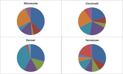
This gives an okay idea of what teams may have something within their culture that needs addressing, but it’s without a doubt misleading. I would be comfortable saying the the St. Louis Rams are a “less criminally inclined” organization than the Minnesota Vikings, but when you try to compare Minnesota to Tennessee, or even a team farther down the list, these claims get murky. This is because not all crime is created equal. Take a look at pie graphs for the top four cities.

ImageCitiesPie

Denver has a lot of Assault and Domestic Violence, how can you compare that to Minnesota where they drink and drive and sag their pants too low? You can’t, it’s imperfect, so those rankings should be taken with a grain of salt.

There are still a couple things I can do to approximate to what degree of criminality would exist if these were a pure random sample of the population. First I calculated 13 year average of the crime rates of the nearest metro area of each NFL team, ranked teams using this and then compared that ranking to their original ranking for total crimes committed by players.

Image

There’s a lot going on here, so I highlighted the important stuff. The numbers highlighted in red are teams whose number of crimes committed by players ranks way higher than the city they are from. Green teams are teams who are ranked much lower relative to other teams given the crime rate of the city they are located in, with a gold star going to the St. Louis Rams.

Another way to look at this is by imagining if the sample sizes for crime rate in the city being the same size as the teams. That means I need to scale down from crimes per 100,000 to crimes per 1170, or 90 preseason players across 13 years. That calculation is simply (Crimes(City)*13/100,000)*(x/1170)

ratiochart

The highest ratio seen here is 1:0.6, meaning that at most NFL teams commit 60% as many crimes as any random sample from their metro area’s population. So while they may appear on the news more frequently, NFL players are significantly less criminal than the rest of the population. Refining this to take into account income bracket would be interesting though.

football-dog_large_large_medium

Some things to keep in mind: (1) Players don’t necessarily live in the cities they play football in, (2) so these crimes were not necessarily committed in the city a player plays in, and (3) this does not reflect how much time a player has spent in any one area. But that’s fine, because life is imperfect. Someday I’ll rebrand this blog as a monument to Wabi-sabi and sell out.

The bar graph, much more so than anything else in this analysis, predicates itself on the idea that more crime in any metro area will mean NFL players of that metro area will commit more crime. However, I found no evidence for this. There’s very little correlation between how much crime there is in a city and how much crime is committed by that city’s NFL team, here’s what that looks like
citycrimecorrelation

This means that the two parts of this analysis that hold the most weight are the chart that shows total crimes committed by teams and the chart showing the difference. It’s clear that in the last decade there have been significant issues  in Minnesota, Cincinnati, Denver, and San Diego NFL programs in either creating enough accountability for players, or drafting and signing irresponsibly. They are, of course, not the only culprits. A+ joke right there.

Oh, you want more? “Vikings” is okay, but “Bengals”? More like the Cincinnati “Batteries” or the Denver “Irreconcilable Differences”. Mile High Stadium should be renamed “Divorce Court”, ha HA got em.

Want my data? God help your soul http://sharesend.com/4eqqsg0w

Musical Industrial Complex

Image

I have paid to see Bob Dylan twice and I have left Bob Dylan concerts early twice. If Bob Dylan is in a city near me again I will buy another ticket and I will again leave early. He really should stop touring, but he hasn’t, and he won’t, and I’m glad. Two options for why he will not stop touring (1) He has nothing better to do (2) He’s getting paid $225,000 on average for each performance. There are a lot of things I would do on stage in every metropolitan area if you paid me $225,000 each time.

I got that number, and many more, from a leaked list from Degy Entertainment that shows the price for booking an artist. Degy Entertainment acts as a middle man between artist managers and booking agents for venues. They are the definition of a middle man. Anyway, from their information I made a dataset that contains all artists that command at least $100,000 to perform. From there I divide by genre (learning towards how the artist is marketed) to examine relative popularity of popular musical genre as live acts.

Here’s all of my data in an unwieldy bar graph
Image

Grouping my data by genre is interesting because genre’s are super subjective and are blended really closely in popular music. If I were to only take song structure then almost every genre that is popular enough to command $100,000+ per performance would be the exact same genre. Life’s a rant.

Summary by genre (Total and Average are in 1,000s)
Image

The problem is that any one of these columns does not convey the whole story. The large variance of sample size in the count of artists complicates both the total commanded and the average. The count itself does a decent job, but how can you know that a large number of artists is not just a bunch of artists hovering around the 100,000s, while a smaller sample could have a couple artists in the exclusive 1,000,000+ sphere?

Unfortunately I don’t have a test for this. But by using a test for correlation (.58) and doing a student’s t-test (p value < .05) on count and average I know that more artists increases how much each artist is paid, which is possibly the most interesting outcome. Having a greater supply should drive price down, but apparently we have a half-decent argument for Say’s law, which in intro Micro says “supply creates its own demand”. I’m not getting too excited though, look what blog this is on and please lower your expectations accordingly, by cutting my sample off at $100,000 there’s plenty of stuff going on I don’t account for.

Anyway, here it is, as best I can determine, relative popularity of musical genres
rank

For clarity’s sake
1. Pop
2. Singer/Songwriter
3. Rock
4. Singer
5. Alternative Rock
6. Country
7. Hip Hop
8. R&B
9. Indie
10. Electronic
11. Hispanic
12. Soft Rock
13. Entertainment
14. Reggae

This list could of course be expanded if I went below $100,000, but I’m happy with a 150ish row dataset when I’m the one making it from scratch. I really need to see about setting up a Shitty Data intern for work-study.

Want my data? God help your soul http://sharesend.com/o17wc46m

990 Problems

Image

[Have intern research a killer accountant joke]. That joke aside, accountants are great because they file 990 forms for organizations that are publicly available. 990s have a huge amount of information on the financial status of universities, for instance. However, “publicly available” is one of those things in life that can be technically correct but misleading. Recent 990s are a pain in the ass to access let alone read. Some organizations make it easy on you to find them, keeping them on their website, usually on a page dedicated to the Controller. Xavier University is one of those organizations.

Image

Do you see what that says? Xavier has a bank account in the Cayman Islands.

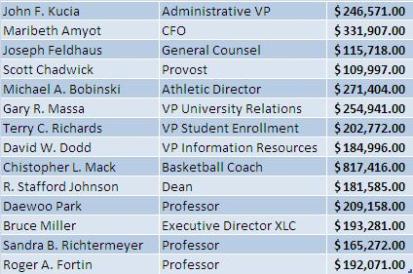
Here are the top salaries at Xavier
Image

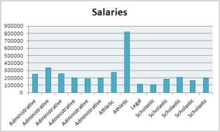
Visualized
Image

And compared
Image

Not all universities are as forthcoming with information to this level of detail. In fact, the only other school in The Big East that provides detailed access beyond what is required by the IRS other than Xavier is Marquette. Using the salary of their (former) head basketball coach and the total compensation to employees of both universities we can compare how the two universities value their coaches, and by extrapolating, their basketball program.

Image

Good thing Mack got a raise this week. Marquette has a lot more employees than Xavier, so either Mack is underpaid or Buzz was overpaid for programs with relatively similar recent success. To all of my future accountant readers, which I am going to generously estimate at 1.5, make these things available because this would have been hella cool if I recent 990s for all Big East schools.

Image

Want my data? God help your soul http://sharesend.com/1o4lq19z

Do Dads Love Santana?

Image

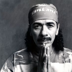
What’s not to like about Carlos Santana? I know my dentist appointments would be WAY different without him. The hypothesis was recently brought to me that everyone’s dad likes his song ‘Smooth’ featuring teen heartthrob Rob Thomas, which does not sound false to me. It won a Grammy and is the only song to be in the top 5 of the Hot 100 Songs across two centuries (file under: statistics can be misleading). However, data on song listenership is nearly entirely controlled by the music branch of Nielsen Company, who has proprietary rights to information that goes into making the Billboard Hot 100.

To understand the connection between dads and ‘Smooth’ I’ll have to be a little more vague in my approach. I have facebook demographic data (sort of) for 2014 that tells me that our dad’s account for about 12.7 million users or about 15.6% of all users of the site. I’ll take a random sample from the Santana Facebook fan page and see what percentage of that sample could be our dads. There’s more bias and sampling error here than I have time to list, so just bear with me.

Apparently I only have three facebook friends that like his page, I need to reevaluate some things.

Image

Apparently Facebook changed fan pages a few months ago so I can only see if my friends like a certain page. So instead of taking a random sample of fans, which already would have been #shittydata I will now sample comments from the most recent posts by the page.

Of the 68 comments I “randomly” sampled, 17 of them could have been my dad, except that most of them are Hispanic. They are also mostly IN Spanish so they could be hate messages to Santana for all I know. That means that 25% of my sample fall in the ‘dad’ category, much higher than the percentage of dads on Facebook. This means that dads on Facebook are more likely than other demographics to like/contribute to the Santana fan page and if you’re a Santana fan you HAVE to be a ‘Smooth’ fan, though I’m sure these guys could recommend some tasty deep cuts.

Stay tuned in a few weeks when I start my internship at Nielsen solely to obtain information on Santana’s ‘Smooth’ listener demographics.